Why Do Some Casino Games Feel Tiring After 10 Minutes?
A casino game can look exciting at first and exhausting a few minutes later. The screen flashes, symbols bounce, counters change and sounds punctuate every action. Yet the problem is not simply that the game is colourful or fast. Fatigue often comes from the way its visual and audio elements compete for attention, especially on a small screen.
Good design gives players clear signals: what happened, what they can do next and which parts of the screen matter. When those signals are buried under too many effects, a game asks the player to keep sorting information that should have been easy to read. That can lead to visual overload, audio fatigue or both.
For designers, the challenge is not to strip away all spectacle. It is to make spectacle serve the experience. A coherent theme, legible mobile layout, recognisable lobby thumbnail and purposeful animation can make a game feel lively without making every moment demand attention.
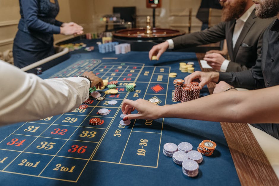
Photo credit: La Planque Du Joueur on Unsplash.
Fatigue is a design problem, not just a matter of taste
Players differ. One person may enjoy bright colours and busy animation; another may prefer a quieter screen. But some patterns commonly make an interface harder to use: tiny text, low contrast, overlapping motion, loud or repetitive sounds, and unclear feedback.
These issues are especially noticeable on a phone. The screen is close to the player’s face, the usable area is limited, and small controls can be awkward to tap. A design that feels spacious on a desktop monitor may become cramped on mobile. If players have to squint, hunt for information or work out which animation signals a result, the effort accumulates.
Fatigue can also build through repetition. A celebratory sound may feel satisfying once. If it plays after every minor action, it can become grating. A burst of particles may draw attention to a significant event. If every spin or tap triggers a burst, the effect stops communicating importance and starts competing with the rest of the screen.
When a theme becomes a coherent visual world
A strong theme can make a game easier to understand, not merely more decorative. Its colours, symbols, background, typography and sound can all suggest the same setting. A game built around a night market, for instance, might use warm lantern colours, signs inspired by shop fronts and a restrained palette of market sounds. Those choices help the different parts feel like they belong together.
The trouble starts when every asset tries to be the star. A background may be detailed, symbols may glow, buttons may pulse and a character may move constantly in the foreground. Each element might look polished on its own, but together they can create visual overload. The player has no quiet area in which to focus.
Coherence depends on hierarchy. The game should make its most important information easiest to find. Secondary decoration can add character, but it should not obscure the action, cover key values or pull attention away at the wrong moment.
Make decoration support the information
Designers can test a theme by asking a simple question: if the animation stopped, would the screen still make sense? Players should be able to identify the main action and read essential information without waiting for a flourish to finish. Motion can enrich a visual world, but it should not carry basic meaning on its own.
Colour also needs a job. It can distinguish different states or highlight a useful control, but using the brightest colour for every element weakens that distinction. A calmer background makes an important button easier to spot. Consistent icon styles and spacing help the screen feel organised, even when the setting is fantastical.
Mobile readability: can the player understand the screen at a glance?
On a phone, readability is not a finishing touch. It is part of the game’s core usability. Text that looks clear on a large design mock-up may become tiny in a real session. Controls that are easy to click with a mouse may be too close together for a thumb. A decorative edge or overlay can take up space needed for the actual game.
A useful mobile check is to open the game on a small screen and ask someone to identify the key information without explanation. Can they find the main control? Can they tell what changed after an action? Can they read the relevant labels without zooming or leaning closer? If the answer is no, adding more animation will not solve the problem.
Clarity is about more than font size. It includes contrast between text and background, the amount of information shown at once, the spacing around controls and the way the layout responds when the device changes orientation. A screen that works only at one size is a fragile design.
Design for sound-off play, too
Some people play with their device muted. Others may be in a quiet room, using headphones at low volume or relying on captions and visual cues. If a sound effect is the only indication that an action succeeded, the interface becomes less clear for those players.
Important feedback should have a visual counterpart. A changed label, a clear state transition or a concise message can communicate what happened without sound. This also helps players who miss an audio cue or find repeated sounds tiring. Sound can add texture and character, but essential information should not depend on hearing it.
Why lobby thumbnails matter before the game even opens
A casino lobby often presents many games as a grid of small images. At that size, a detailed scene can collapse into a colourful blur. A thumbnail has a narrow job: help someone recognise a game and distinguish it from its neighbours.
This is a different design challenge from building a full-screen visual world. Fine details that look attractive on a large display may vanish in a small tile. Too much text becomes illegible. Several competing symbols can make the thumbnail hard to identify at a glance. The result is not just a weaker first impression; it can also make browsing more tiring.
Recognition improves when a thumbnail has one clear focal point, a controlled palette and a silhouette or symbol that remains distinct at small sizes. A consistent visual identity can help players recognise a title later without requiring them to decipher a miniature poster.
Test at the size people actually see
Designers should review lobby art at its real display size, not only in a full-resolution file. A quick test is to shrink the image to the approximate dimensions of a phone lobby and check whether the main subject remains obvious. If the artwork needs a caption to explain what it shows, its central idea may be too complicated for the format.
It is also worth novinite.com viewing the whole lobby, not just one tile. A single bright thumbnail may be readable in isolation, while a row of equally bright images creates a wall of visual overload. Consistent spacing and a sensible balance of colour can make the browsing experience easier on the eyes.
Animation as feedback and attention control
Animation is most useful when it tells the player something. A button can change state after a tap. A symbol can move into place to show where it landed. A brief highlight can guide attention to a result. In each case, motion has a clear purpose: it connects an action to its outcome.
When animation is constant, that connection gets weaker. If the background moves, symbols pulse, characters react and interface elements bounce at the same time, it becomes harder to know what deserves attention. The player must keep filtering the screen. This is one route to visual overload, even if each individual effect seems harmless.
Animation also controls pacing. A short transition can make an outcome easier to follow. A long sequence that delays the next action can feel like friction, especially when repeated. Designers should consider how often an effect appears, how long it lasts and whether the player can move on without waiting.
Use motion with a clear hierarchy
A practical approach is to reserve the strongest animation for moments that genuinely matter. Keep routine transitions quick and restrained. Avoid running multiple attention-grabbing effects at once. If the interface already communicates an event through a colour change or label, an additional explosion of particles may add noise rather than clarity.
Players also need control where possible. Options to reduce motion, mute or adjust sound, and skip or shorten repeated sequences can make an experience more comfortable. These options should be easy to find, not hidden behind several layers of menus. Accessibility settings are part of good product design, not a substitute for a readable default experience.
Audio fatigue: when every action comes with a sound
Audio gives a game texture. A gentle ambient bed can support a setting, while a distinct cue can confirm an action. But repeated or overlapping sounds can become tiring, especially when they are loud, sharp or played at the same volume regardless of importance.
This is audio fatigue: the sense that sound is demanding too much attention, or simply wearing thin, over time. It can happen when the same cue repeats rapidly, when sound effects overlap without a clear mix, or when music and effects compete for the foreground. A sound that is intended as feedback may become irritating if it fires after every small event.
Good sound design uses contrast and restraint. Not every action needs a separate cue. Important sounds should be distinguishable from background audio, and volume should feel consistent rather than jump unpredictably. Players should be able to adjust levels or mute effects without losing access to essential visual information.
A quick design check for teams
Before a release, teams can use a short review to identify likely sources of fatigue. The goal is not to remove all personality. It is to check whether the game remains clear and comfortable during ordinary use.
- Check the phone version. Read the labels, tap the controls and confirm that key information is visible without zooming.
- Play with sound off. Confirm that every important action still has clear visual feedback.
- Listen to repeated play. Notice whether cues become annoying, overlap or sound equally urgent.
- Watch without interacting. See whether motion continues to compete for attention when the player is not acting.
- Inspect the lobby tile. Reduce the artwork to its real thumbnail size and check whether it remains recognisable.
The best effect is the one that helps
Some casino games feel tiring after 10 minutes because their screens keep asking for attention without giving enough clarity in return. A busy theme, tiny mobile text, indistinct lobby art, constant animation and repetitive audio can all contribute. Together, they make simple interactions feel like work.
The answer is not to make every game quiet or minimal. It is to give each design choice a purpose. A coherent visual world helps players understand where they are. A readable mobile screen lowers effort. A recognisable thumbnail makes browsing easier. Animation can explain outcomes, while restrained sound can add character without becoming a burden.

When effects are selective and information is easy to find, the game can still feel lively. It simply stops making every element compete to be noticed.
Casino games involve gambling and can carry financial risks. Set limits, take breaks and seek support if gambling stops feeling recreational.